High-Converting CTAs That Fit Quiet Funnels
Most CTAs fail for a boring reason: they ask for a behavior your page has not logically earned.
A reader lands from Google. They want an answer, not a relationship. If your button says “Book a call” before you have defined the problem, the mechanism, and the next step, you are forcing a leap. High-converting CTAs are rarely “clever.” They are structurally correct.
This matters even more if you are building a faceless, low-noise income system. Your CTA is the handoff between traffic and monetization. If the handoff is vague, pushy, or mismatched, you do not just lose a click. You break trust in the entire system.
What makes a call to action “high converting”
A CTA converts when it aligns three things: the reader’s intent, the offer’s role in your funnel, and the level of commitment you are asking for.
Intent is the reason they clicked in the first place. Funnel role is what that page is designed to do (capture an email, pre-sell an entry product, move a warm reader to a core offer). Commitment is the cost – time, money, identity, or attention.
When those three are aligned, your CTA feels like the obvious next step. When they are not, your CTA feels like friction.
The quiet-funnel CTA stack (so you stop guessing)
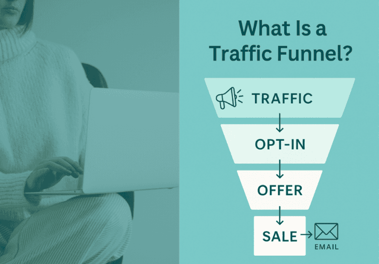
If you want compounding outcomes without constant posting, you need a predictable ladder. A simple version looks like this:
Top of funnel: search or evergreen traffic lands on one focused page.
Middle: a low-friction opt-in that captures the lead and continues education.
Bottom: a paid offer that solves the problem with structure.
Your CTAs should reflect that ladder. Most pages only need one primary CTA and one secondary CTA. More buttons usually means less clarity.
High converting call to action examples by funnel job
“High converting call to action examples” only help if you know what job the CTA is doing. Below are examples you can adapt, grouped by role inside a quiet funnel.
1) Lead capture CTAs (low commitment, high volume)
Lead capture CTAs work when they promise a specific outcome and reduce uncertainty about what happens after the click. They should sound like a next step in learning, not a subscription to your personality.
Use these when your traffic is cold (SEO, Pinterest, long-tail search) and the reader is still orienting.
Good CTA phrasing tends to look like: “Send me the [asset]” or “Get the [framework].” It is concrete and procedural.
Examples that fit system-based funnels:
“Get the funnel map (PDF)”
“Send me the checklist”
“Download the 3-step template”
“Show me the email sequence”
“Get the exact structure”
Notice what is missing: hype and identity language. You are not asking them to “join a movement.” You are offering an asset that reduces confusion.
Where this converts best is after you have demonstrated the value of structure in the body of the content. If you place this CTA above the fold, it can still work – but only if your headline and first paragraphs have clearly defined the problem.
2) Entry product CTAs (small commitment, strong qualification)
An entry product CTA is not just about revenue. It is a filter. The goal is to move someone from “interested” to “willing to execute.” That means your CTA must connect the purchase to a defined constraint: time, complexity, decision fatigue, or uncertainty.
The best entry-product CTAs are calm and specific. They do not rush. They clarify.
Examples:
“Get the blueprint and build this in one weekend”
“Start with the 3-step setup”
“Use the template pack to set your funnel logic”
“Build the system first, then scale traffic”
These convert when the page has done one key thing: it has named the real cost of staying where they are (usually chaos and rework), without moralizing it.
If you are selling an entry offer like Miss K Digital’s 3 Step Invisible Income Blueprint, the CTA should match that positioning. The promise is not “instant results.” The promise is reduced complexity and a stable starting point.
3) Core offer CTAs (higher commitment, high clarity)
Core offer CTAs fail when the page tries to do all the persuasion inside the button. The button is not the argument. The page is.
For a core offer, your CTA should feel like initiating a defined process: enroll, get access, choose a path, start the system.
Examples:
“Enroll in The Invisible Income Method”
“Get full access”
“Choose your track and start building”
“Build the complete system”
“See what’s inside”
One trade-off here: “See what’s inside” often converts better than “Buy now” because it matches reader psychology. But it can reduce purchase intent if your sales page is already long. Use it when your audience is skeptical and wants proof of structure.
4) Affiliate CTAs (ethical, decision-support focused)
Affiliate CTAs are where a lot of faceless builders accidentally erode trust. If your CTA sounds like you are trying to “get the commission,” the system breaks. Your CTA should feel like decision support.
Ethical affiliate CTAs:
“Compare the two options”
“Check current pricing”
“See if it fits your setup”
“Get the tool I use for [specific job]”
“View the feature list”
These work because they match what a reader is actually doing at that moment: evaluating. They also reduce pressure. Pressure is not a strategy. It is a short-term substitute for clarity.
Why these examples work (the conversion mechanics)
High-converting CTAs usually include one of three conversion mechanics: specificity, reduced risk, or clear sequencing.
Specificity means the reader knows exactly what they get. “Download the checklist” beats “Learn more” because it defines the asset.
Reduced risk means the CTA lowers the perceived cost. “See what’s inside” or “Get the sample lesson” lowers risk without using fake urgency.
Clear sequencing means the CTA matches the step they are on. “Start with the 3-step setup” works because it implies order. Order is calming. Order reduces decision fatigue.
Placement: where CTAs convert in quiet content
If you want a low-noise system, you want predictable placement. You do not need buttons everywhere. You need the CTA at the moment the reader reaches certainty.
For SEO blog content, that moment is usually after you have:
- defined the problem in plain language,
- shown the mechanism that fixes it,
- given enough proof through clarity (not testimonials alone).
That is why the best-performing CTA is often mid-article, right after your first practical framework. A second CTA near the end can convert readers who needed the full explanation.
A sidebar or sticky bar can work, but it depends on audience tolerance. For burnout-prone, skeptical readers, aggressive sticky CTAs can feel like pressure. If you use them, keep the wording neutral and asset-based.
How to write your own CTA (without copywriter gymnastics)
You do not need more adjectives. You need a sentence structure that forces alignment.
Use this framework:
Verb + asset/next step + outcome context.
“Get the funnel map so you can stop guessing what goes where.”
“Start the 3-step setup and stabilize your offer path.”
“Compare the tools so you choose once and move on.”
If your CTA feels weak, the fix is usually not the verb. The fix is the outcome context. Outcome context connects the click to relief.
Micro-commitments that increase conversions
If your audience overthinks, micro-commitments help. These are small yeses that lead to a bigger yes.
Instead of “Buy,” try “See what’s included.” Instead of “Subscribe,” try “Send me the template.” Instead of “Book a call,” try “Answer 5 questions and get the right path.”
The trade-off is that micro-commitments can reduce immediate revenue. They often increase overall conversion and long-term list quality, which is the point of a compounding system.
Common CTA mistakes in faceless funnels
The most common mistake is asking for trust before you have built it. “Join my newsletter” assumes they want ongoing contact. Many people do not.
Another mistake is mislabeling the step. If a button says “Free training” but leads to a sales page, you create cognitive dissonance. Even if you get clicks, you lose long-term conversion because the reader learns to doubt your labels.
A third mistake is stacking multiple primary CTAs that compete. If you offer an opt-in, a webinar, a discount, and a call on the same page, you are outsourcing prioritization to the reader. Overwhelmed readers will choose nothing.
A calm way to test CTAs (so you improve without chaos)
Do not test everything. Test the highest-leverage variable first.
Start with the CTA promise, not button color. Change “Get updates” to “Get the checklist.” Or change “Learn more” to “See what’s inside.” Run that for a set traffic volume, then decide.
Next, test placement. Mid-article versus end-of-article is often a bigger lift than any wording tweak.
Finally, test commitment level. If your core offer CTA is not converting, it might not be the CTA. It might be that the page needs a lower-step CTA first (opt-in or entry product) to match cold traffic intent.
Your CTA is not a motivational slogan. It is a piece of system architecture. When you treat it that way, “high converting” stops being mysterious. It becomes repeatable.
Build the next step so cleanly that the reader feels relieved to click it. That is the quiet standard to aim for.